About the Project
Jump Desktop is a secure and reliable remote desktop solution that allows users to access and control their computers from anywhere. This project focused on designing the landing screen UI for the desktop application, aiming to create an intuitive, visually balanced experience that welcomes users and guides them effortlessly into their remote sessions.
My goal was to design a new look that felt modern yet functional, with clear emphasis on usability, system status, and quick navigation. The design reflects trust, control, and simplicity — key values for any remote access tool. This project explored the harmony between aesthetics and utility, ensuring the interface supports both first-time users and seasoned professionals with ease.

First glance on the previous website
It all began with a UX Audit of the existing website. Through this audit, I was able to understand the UX heuristic and usability issues which needed to be addressed. But before that, the company needed a fresh and new design language and style which resonated with the brand and could stay consistent throughout the design.
UX Audit Results
-
Visual clutter and hierarchy
Finding:
The interface is visually cluttered due to an overload of text elements competing for user attention. There is minimal use of negative space.Impact:
This makes it difficult for users to identify key information or actions at a glance. Resulting in poor visual hierarchy and a lack of breathing room, causing cognitive load.Recommendation:
Streamline content to highlight only the most essential information, reduce redundant or dense text, and incorporate generous negative space to improve scannability and visual comfort. -
Inconsistency
Finding:
The interface displays an inconsistent design language across components, including variations in typography, spacing, button styles, and iconography.Impact:
Inconsistencies reduce user trust and increase cognitive load, as users must constantly reorient themselves with each new screen or element.Recommendation:
Establish and apply a unified design system, including consistent styles for typography, spacing, color, and components. Reinforce visual patterns to create a seamless, predictable experience that builds user confidence. -
Accessibility Issues
Finding:
Color contrast ratios, small text sizes, or missing keyboard navigation may hinder accessibility.
Impact:
Users with visual or motor impairments may find the product difficult or impossible to use.
Recommendation:
Audit for WCAG compliance and adjust styles for better contrast, readability, and inclusive interaction methods.
Prioritization Matrix
A prioritization matrix activity with the team allowed me to focus on tasks that were highest on impact and could give us fast wins, and also the most crucial to the business.

Light and Dark Theme
To enhance user experience and accommodate different user preferences and environments, I designed both light and dark themes for the product interface. The light theme offers a clean, bright, and airy feel, ideal for well-lit environments and users who prefer traditional, high-contrast visuals. It focuses on clarity and simplicity with soft backgrounds and vibrant accent colors to guide attention.
The dark theme provides a sleek, modern alternative with darker backgrounds and muted tones, reducing eye strain in low-light settings. It maintains consistent hierarchy and legibility by carefully selecting contrast ratios that comply with accessibility standards, ensuring usability for all users.
Both themes use a unified design language, ensuring smooth transitions between modes without disrupting the user experience, while addressing visual clutter and maintaining accessibility throughout.

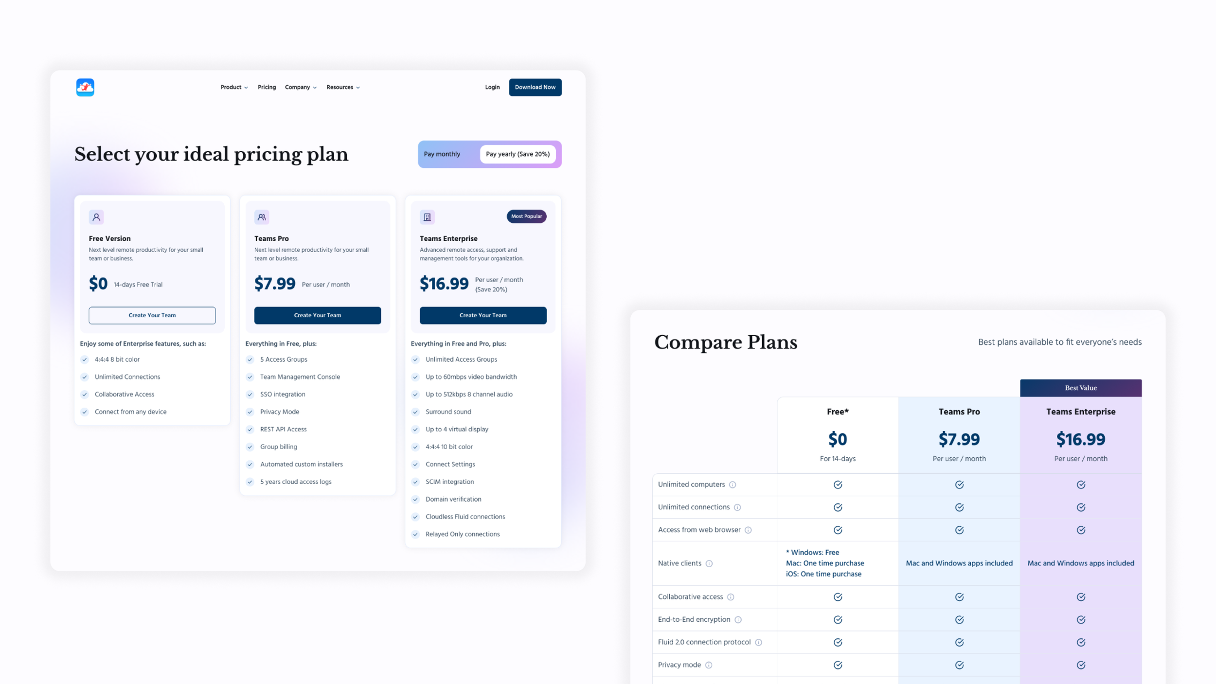
Final Designs
In the final designs, I crafted both desktop and mobile-responsive versions to ensure a seamless experience across devices. I developed a fresh style guide for the brand, introducing a harmonious palette of colors and gradients, carefully selected typography, and a cohesive icon set that together bring a unified, modern aesthetic. The redesign reflects our key insights: a clean, contemporary look, clear and concise information, thoughtfully structured visual hierarchy, and ample negative space to let the content breathe. It also provides intuitive guidance for new users—clearly showcasing what the company offers, how to download the software, and detailing pricing plans and benefits in an accessible, engaging way.